
In this fourth part of New Season Knitwear, I look at the trend for contrast colour edgings in knitwear on the catwalks- and give suggestions for how knitters can be inspired by this trend, including some pattern suggestions.
(This post was originally scheduled to be published earlier in Autumn/Winter 2018-19. While the trend is still ongoing, unfortunately some products may be no longer be available.)
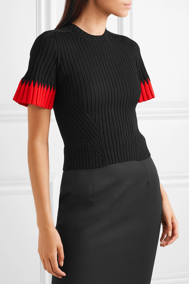
Hems and cuffs continued to follow their own colour story in many of the collections of Autumn Winter 2018-2019.
Contrast colour edgings sound like a relatively minor feature of a knitwear design, and yet they can totally change the character and impact of a garment. A bright pop of colour can add a humorous, quirky touch to an otherwise simple piece, while the choice of edging colour on a multi-coloured garment can decide the overall impression of its colour by drawing out particular hues.


An edge colour can also bring architectural definition- a little like a leaded divider in a stained glass window- for a more dynamic, strong look. Conversely, a gradient or striped border gives a softer, almost watercolour effect to pieces.
An edging can even evoke an entire tradition, such as the contrast red colour borders on cream sweaters at Gucci that suggested classic baseball attire.
Knitting inspiration
This trend can be imitated in any knitting project with the addition of a stripe of colour at an edge, e.g. hem, cuffs, button bands, neck border. As mentioned above, the choice of colour can really effect the feel of the overall piece, so it might be a good idea to play around with lots of swatches before actually committing to the final look.
If you are interested in thinking more about how colours work with each other, you might like to have a look at the Bluprint class by Franklin Habit: A Practical Approach to Color for Knitters (here)
You might also like to check out other knitters’ projects in Ravelry for colour inspiration. E.g. if you would like to add a contrast stripe or edging to a design that is intended for one colour: go to the pattern page > projects > advanced search and then select ‘2 colours’ in the Colours box in the left hand toolbar-this will show you any examples of the project worked with two colours.
There are also many patterns that are designed to have contrast colour details- see just a few suggestions below!


Clockwise from top left: Gradient Dip by Suvi Simola (here), Gelato by Chantal Belisle (here), Audrey Cardigan by Isabell Kraemer (here).
Over to you
Do you like these contrast colour details? Have you ever added a pop of colour to a one colour pattern? Please share any recommendations for other knitting designs that use contrast colours as accents!

1 thought on “New Season Knitwear: On the Edge”